The power of colors in marketing can not be underestimated. Companies make use of color combinations to appear more visually appealing to consumers. Color theory is utilized to influence a consumer’s desire to buy an item. The color, look, and feel of a product can affect a consumer’s desire to buy an object by 93%. Let’s dive deeper into the psychology of colors in marketing.
So, what is color psychology?
Color psychology is the study of how colors are known to impact a consumer’s perception and behavior. In marketing, colors leave an impression on consumers and can ultimately sway their decision towards buying a product. For the success of a new product or brand, a marketing manager should understand the meaning of colors in marketing and branding.
Studying the psychology of colors in marketing should be taken into account before any major rebranding or product release. This is because the initial impression of a product, which relies largely on the color, can lead to tipping the scales in the brand’s favor.
The effects that individual colors have on consumers:
With the influx of new brands and products that keep cropping up in the market, it is vital to make your brand as visually appealing as possible. In marketing, first impressions can lead to a greater level of consumers being interested in your brand. Understanding the science of colors in marketing will help make your message and brand stand out
Check out these 4 ways through which your brand can make a killer first impression.
Making use of the psychology of colors in marketing and understanding its nuances can take your brand above and beyond. Listed below are some of the major colors that are used in marketing, as well as their psychological underpinnings:
#1. Red: Red is perhaps one of the most popular colors used in marketing. The psychology of color red in marketing has an intense appearance that catches the eye of individuals and it is thought to increase appetite, symbolize intensity and passion.
In marketing, the color red induces a sense of urgency in the onlooker and targets impulsive shoppers the most. It is used by Target, Heinz, YouTube, Netflix and many fast-food chains like McDonalds and KFC.
Red in large quantities can give the brand an angry or aggressive vibe. Overindulgence in the color red should be avoided for this very reason.
Red is a fairly gender-neutral color with women tending to prefer it slightly more than men.
Here’s how Target used red in its branding strategy:
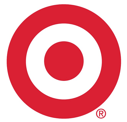
This simple bullseye has been so effective because you’ll notice consumers no longer type out the brand’s name.
Instead, they use this symbol when talking about Target, and the color red plays a huge role in this because it’s intense which makes it unique.
Similarly, you’ll note an interesting thing about Coca Cola’s logo:
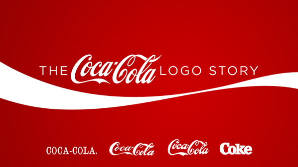
Despite changes in the font of the logo over time, the one thing that remained consistent about Coke’s logo is the color red.
That’s because our brains process visuals 60,000 faster than text, which is why colors get imprinted on our minds.
Coca Cola’s red logo portrays love and happiness (which only true Coke addicts can understand!).
It’s one of the few brands that has pulled off marketing an intangible feature of a tangible product.
#2. Yellow: Yellow is thought to be the happiest color on the spectrum, and it is linked to the increase in positive and friendly feelings. In marketing, yellow is used to represent clarity, optimism, and creativity.
For this very purpose, yellow is marketed towards a younger audience, as it is the color that infants react to the most.
It is among the most psychologically complex colors on the spectrum and stands out quite a bit.
Using the right balance of yellow can succeed in gaining attention from window shoppers.
Yellow is used by DHL, IKEA, and CAT. If yellow is used excessively, then it can signify fear, caution, anxiety, and even irrationality. That’s why so many hazard signs have yellow backdrops!

Men tend to prefer yellow more than women, and it can be even more effective if it is used with darker colors.
#3. Blue: The psychology of color blue in marketing is thought to curb appetite and lend an air of sophistication to a brand. It promotes a sense of security and is often used in office spaces to impart an air of calmness.
Blue is a very non-invasive color, and in gendered marketing, it is targeted primarily towards men.
The color blue is used to retain a greater number of customers and increase brand loyalty. It is used most famously by Facebook, JP Morgan, LinkedIn, and Dell.
Excess usage of the color blue can make the branding look cold, unfriendly, or even emotionless.
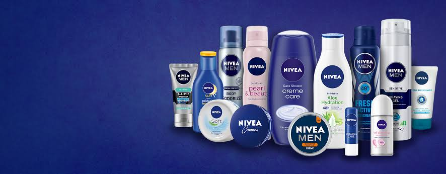
For instance, Nivea heavily uses dark blue for a wide range of its products. Note how some products targeted towards women like Pearl and Beauty are predominantly colored baby pink.
#4. Orange: Orange is used to signify enthusiasm and warmth.
Brands that use orange as their major color can be associated with economically priced goods.
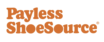
Orange can be utilized like a call to action as it instills shoppers with a sense of urgency. Thrift stores like Payless, Home Depot, and Amazon make use of orange to entice impulsive shoppers.
An overindulgence in orange can negatively impact branding by signifying frustration, immaturity, and even sluggishness. Orange is a pretty gender-neutral color, but women tend to dislike it more than men.
#5. Green: The color green is meant to showcase health and tranquility. It can even be used to imply new growth or signify wealth.
Generally, it can be used in marketing for eco-friendly, or healthy brands. Green is used by the Holiday Inn, Land Rover, and Whole Foods.

The color green, if used abundantly, can have some negative connotations like envy, boredom, or even stagnation. Green has some gender disparity, with men preferring it substantially more than women.
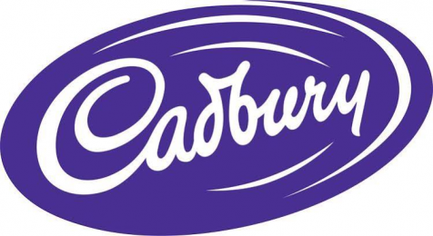
#6. Purple: The color purple denotes royalty, success, and wealth. It is said to have a calming effect in marketing and is used by cosmetic brands quite frequently.
Purple lends an air of sophistication and luxury to any product and it is used by Cadbury, Hallmark, and Syfy.
Purple in large quantities is thought to indicate moodiness or even suppression, so it is important to not go overboard with this particular color.
Purple is shown a clear preference by women and additional tints to it can make it even more feminine.
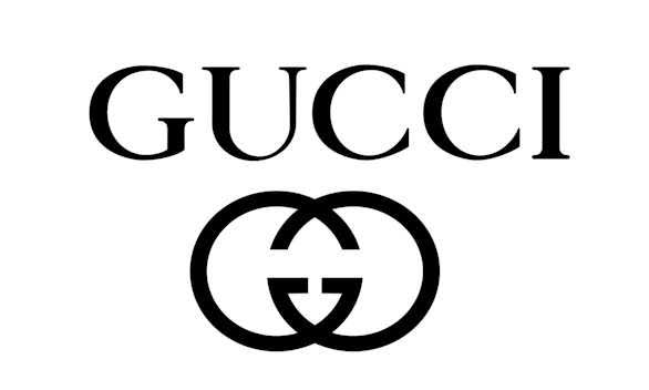
#7. Black: Black is used to enhancing a company’s sense of sophistication, class, and power. It is a relatively subdued color that is still quite attention-grabbing.
It can be marketed towards consumers that are a bit more reserved.
High street brands like Hugo Boss, Puma, and Gucci use this color heavily.
If black is used excessively, then it can negatively impact the branding by denoting coldness, oppression, or even mourning.
Black is quite gender-neutral and no clear preference is shown for this color. It is thought to be more suitable for some industries like fashion.
#8. White: White or silver colors can amplify the feeling of cleanliness, purity, and lend a minimalistic air to a product. In marketing, white is used a lot as a contrast and can declutter the branding of a product.
Brands that utilize the color white include Adidas, Sony, and Apple. If white or silver is used in excess however, it can give off a sterile or empty feeling, so it is important to use white sparingly.
As white is a fairly neutral color, it is not particularly liked or disliked by either gender.
The Adidas logo is super simplistic, which highlights the minimalistic and functional element of the sports brand. Set against a backdrop of black, the white becomes much more eye-catching.

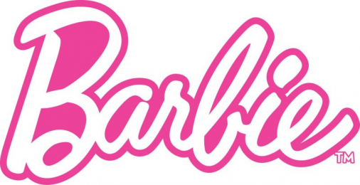
#9. Magenta: Magenta, or pink, is the color that is most highly associated with femininity. It can also be used with other colors to add a more youthful look to the brand.
Magenta is a positive color and can inspire consumers with imaginative, caring, or creative air. If used in excess, however, it can signify impulsivity or rebelliousness.
Some brands that make use of magenta include Barbie, Victoria’s Secret, and Cosmopolitan.
Why the Psychology of colors in marketing doesn’t always work
Although it may seem fairly simple to make use of the psychological effects that individual colors invoke, the color theory can be up for debate. The fact of the matter is, the effect of each color can have a vastly different impact which depends on an individual’s own set of experiences. Aspects such as culture, preferences, and even upbringing can result in the same colors having vastly different effects on people.
For instance, the color green is said to instill a sense of calm and tranquility in a person. However, its effect is highly reliant on the context it is being used in. Green can, therefore, be used to bring awareness to environmental issues or it can also be used to signify wealth and finances.
Similarly, brown can give off a rugged appeal for brands like Hollister. In different contexts, it can be used in collaboration with other colors to give a more inviting or indulgent feeling like chocolate advertisements.
The important thing to remember is that there are no best colors to use in marketing. However, there are ways to decide which colors will suit your brand the most.
Choosing the right color for your brand
When choosing the color for your brand, you should pick something that fits your product or signifies what your company stands for. In order to make the best decision, conducting a small customer survey can really help you understand which colors the majority of your audience react positively towards. Consumer research will help you get a better understand of the psychology of colors in advertising and marketing, including how to use the psychology of colors in marketing and branding.
To get a better understanding of this you must answer some questions:
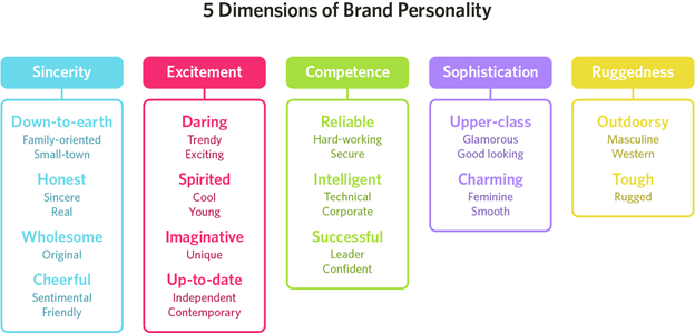
#1. What does your brand stand for?
In choosing a color for your brand, you should take note of your brand’s personality. The colors of your choosing should align with what the brand stands for.
To pick the right color, you can try to figure out which niche your brand fits in. Does your brand’s personality denote sophistication, excitement, competence, ruggedness, or sincerity?
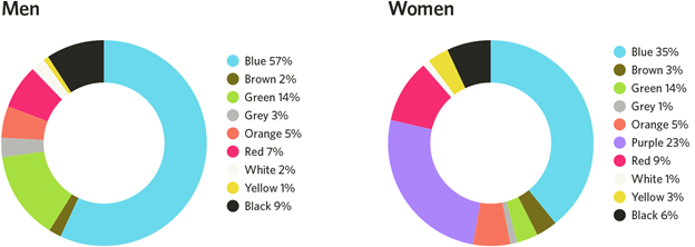
#2. What is your brand’s target audience?
Another major point of note is your brand’s audience. Is it comprised mostly of men or women?
Different colors in the spectrum can target different genders. It is up to your discretion whether your brand would benefit from sticking to the gendered norms or if it went against the norms and chose colors that can improve your brand’s individualistic nature.
The figure below outlines the colors that are favored the most by men and women:
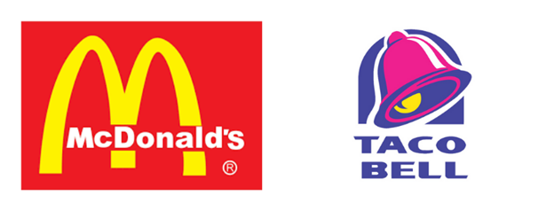
#3. What is the branding color of your major competitors?
Another way to stand out amongst the crowd is to make note of the branding colors of your competitors. By choosing colors that are dissimilar from your competition, you can carve your brand’s niche in the market and create your own audience.
For instance, the main branding colors for McDonald’s are red and yellow, but Taco Bell’s colors are purple. Taco bell, which became a fast food chain much later than McDonald’s, made use of the purple more predominantly so it could stand out when compared with competitors like KFC and McDonald’s.
#4. What are the names of the colors you are choosing to represent your brand?
Colors do have a major impact on a consumer’s first impression. But the name of colors can also elevate your brand substantially.
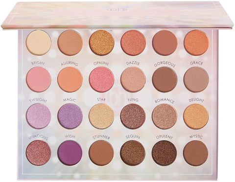
For instance, although the colors brown and mocha are essentially the same, consumers being surveyed favored the color mocha more. This trick is used often by makeup and cosmetic brands to improve a brand’s relatability and attractiveness.
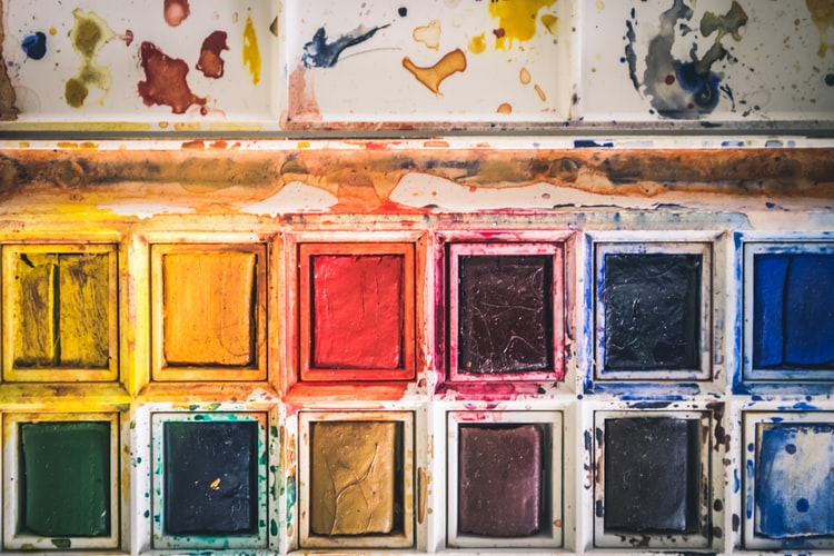
For instance, the makeup palette pictured below has a wide range of shades that can be used for everyday looks. Yet colors like lilac are named “Magic” and other neutral colors like brown are called “Stunner” or “Opulent” or “Mystic”.
Naming the colors like this can lead customers to react to the palette in a more positive way. It can also make the product more attractive as compared to a palette with simple shade names like brown or blue.
Choosing the Right Color Schemes for your brand:
#1. Monochromatic: Making use of a singular color in varying shades can be easy on the eye, and is often used online. It can give your brand a minimalistic yet sophisticated design.
#2. Complementary: This particular strategy employs two colors from the opposing ends of the color wheel. This can draw onlookers and is suitable for your brand if you want to show off a wider range of products.
#3. Triple Color Scheme: This method uses three colors that are equally spaced on the color wheel. The usage of such colors can showcase a harmonious effect. It can be implemented to create a bolder outlook for your brand.
Perception of Color:
Color studies show that varying tints and shades can induce different reactions from men and women. Adding black to colors can result in darker shades while adding white to colors results in softer, lighter shades.
Males reacted more positively to bright colors and females favor soft colors
The results of using the psychology of colors in marketing:
It cannot be said that color is the sole deciding factor that can lead to your brand’s success. This is because it is a combination of marketing techniques and online branding techniques that can ultimately help your brand be successful.
It is, however, undeniable, that making use of the psychology of colors in marketing can help your brand receive much-needed recognition. Various studies conclusively state that ads that are colored perform 42% better than those same ads without color. Brands that understand the psychology behind colors in marketing have recorded significant success when they launch a new product.
Ultimately, nearly 80% of consumers hold the belief that colors help make a brand gain more recognition while 90% of consumers state that their first impression of a brand or product was based largely on color. The colors that you choose to identify your brand with can even influence a consumer’s retention and purchasing patterns. 52% of customers will not return to a store if they don’t like the aesthetic of the store.
Marketing on online platforms is widely different from in-print marketing. Make sure to do your research and learn how to appropriately market your e-commerce venture.
Color theory can be used to influence a customer’s desire to enter your store or buy an item. The look, color, texture and feel of a product can affect consumers’ desire to buy objects by 93% or more.
Different colors affect people in different ways, and can be used to drive customers both toward and away different places and products. For instance, the color red symbolizes appetite, intensity and passion, and is thought to induce a sense of urgency in the onlooker.
While you can use the color red to symbolize intensity and urgency, other colors like yellow can mean happiness, clarity or optimism. Orange is a warm, enthusiastic color that often signifies discount brands. And green can signify health or eco-friendliness, making it a good color to associate with healthy or environmentally conscious brands.
Just making a product a certain color and expecting people to buy it rarely works, but used in conjunction with other design elements like space, shape, texture and more, you can create a winning combination that will draw people to your product.
2 thoughts on “The Psychology of Colors in Marketing”
Comments are closed.